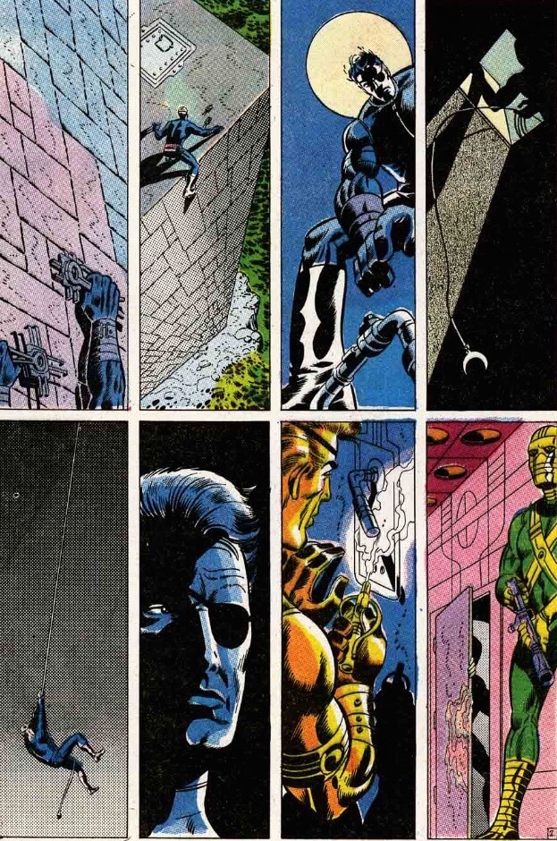
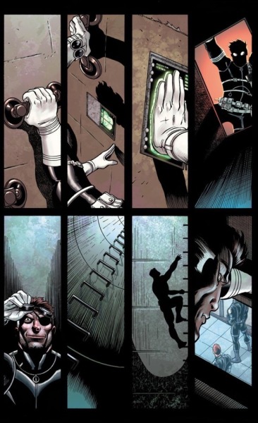
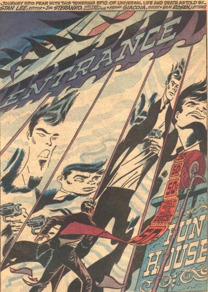
It begins with three silent pages of Nick Fury creeping into the enemy stronghold. Jon Hickman and Ed McGuiness paid tribute to this classic layout in Dark Reign: The List, Secret Warriors #1 (2009).
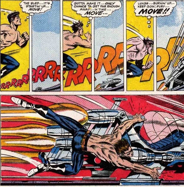
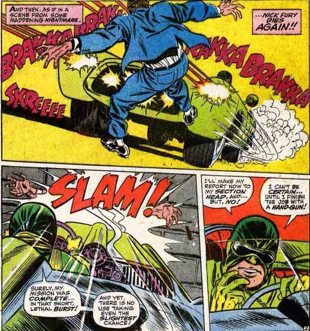
Later in the issue Nick loses his shirt and chases a vehicle…
The story itself is a bit muddled, but visually—both in the rendering and the designs—we see the future of comics. Off-center panels. Jumps from widescreen to narrow. Multi-page spreads, and wonderful panels suitable—literally—for framing. Even magnificent usage of lettering and colors. Steranko’s attempt to create a psychedelic version of James Bond brought out the best of his entire creative team.
We get an Asian SHIELD member (Jimmy Woo), Scorpio (who will be revealed as Nick Fury’s brother) and a horror-comic version of a spy comic.
The amount of creativity in just five comics (#1-3 and #5, because #4 was a fill-in by future creative team Roy Thomas and Frank Springer). Jim Steranko stops doing the stories and interiors with #5, and does his last cover with #7. It’s a huge loss for the series.
This is truly one of the most visually dynamic comics of the 1960s.
But as brilliant as the art was, the stories were a tangled mess. I can’t understand what’s going on most of the time. It didn’t matter, because the visuals drove the tale—it is basically a comic book LSD trip.
And as soon as Steranko leaves, it all falls apart.
Frank Springer does his best to imitate Steranko at first, like in the splash page above, but he’s just a very different kind of artist. Springer’s best work is cartoony, like this scene where Fury gets hit by a car.
And Roy Thomas’ scripts are just not good. I know he’s a legend and all, but a lot of his work in the 1960s is pretty much unreadable.
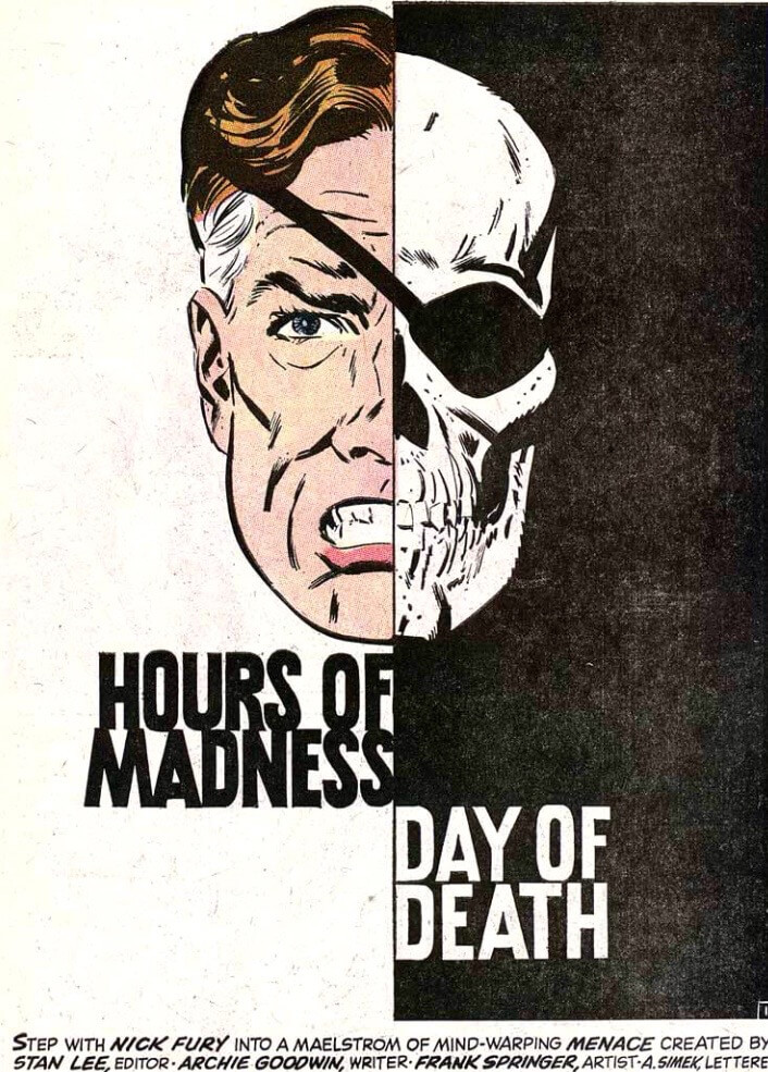
Archie Goodwin comes along with #7 and literally sends Nick Fury on an acid trip, a clear homage to the large number of college students who had resonated with Jim Steranko’s work.
The title ends with #11, and those last three issues are just terrible. But they were published in 1969, so I’m going to break off here and torture myself when I get up to 1969 in my chronological readings.
The letter page could have done with a better title, though…